Measuring your Impact.

There is now a requirement amongst funders and commissioners that voluntary and community organisations can provide measurable evidence of the impact or change that the activities they provide make to communities and individuals. Recent years have seen a shift from simply counting inputs and outputs (for example, the number of people using a service) to measuring outcomes (the difference that the service has made to people).

More importantly, measuring impact enables an organisation to monitor and evaluate the social impact their activities are having on people. If someone asked you right now, “What does your project achieve?”, what would you say to them? How do you know how it’s going, what works well, and what doesn’t? Measuring impact enables you to answer these questions knowledgeably.

What do we mean by Impact?

The word impact can be replaced with words like ‘change’, ‘effect’, ‘outcome’, ‘benefit’ and ‘result’, but they all largely mean the same thing.

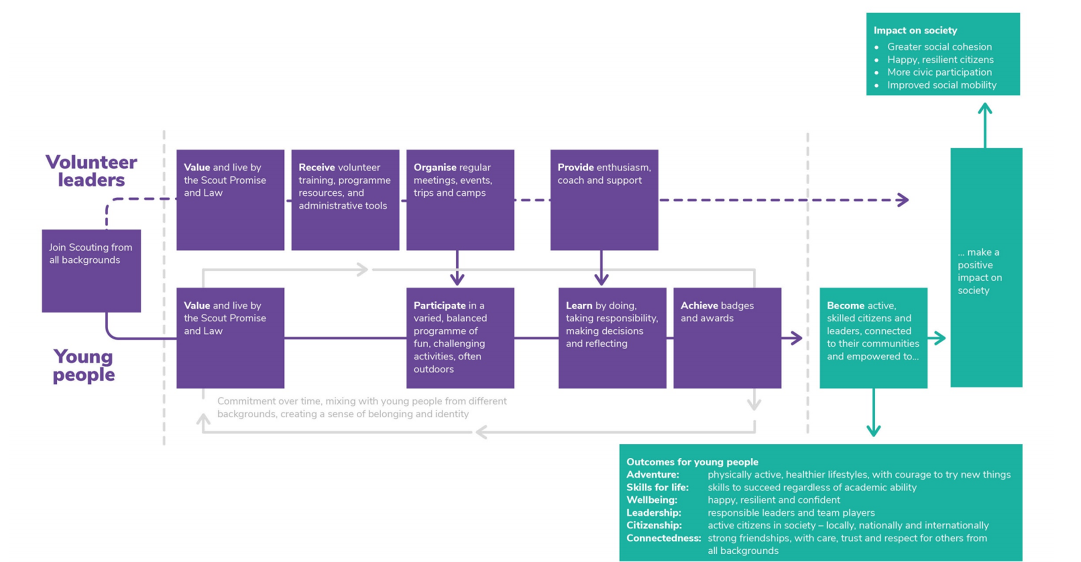
You’ll hear people talking about demonstrating and measuring impact, which means taking a step back and thinking about the difference you make through the work you do and collecting data to show this.

Your impact may be the difference that you make to those who directly use your service, to those in the local community more generally, or to wider society. The impact you highlight can be wide-ranging and can affect many aspects of people’s lives.

The benefits of measuring impact

Collecting data on the difference your project is making has many benefits:

  • Helps you think through the problem you’re tackling
  • See how you are doing and how you can improve
  • Helps plan what you are going to do next
  • Tell your story and inspire others
  • Attracts further funding and investment
  • Raises awareness in the local community

Impact Practice

These are the activities that you do to focus on your organisation’s impact. These can be simply split into 4 steps:

  1. Plan your impact
  2. Collecting Data
  3. Analysing your data
  4. Using your impact data:

Step 1: Using a Theory of Change to plan your impact

The Theory of Change is a planning tool that encourages you to reflect on your aims and plans, to discuss them with others, and to make them explicit.

A clear, concise, and convincing explanation of what you do and the difference you aim to have is a vital foundation of any organisation’s strategy, evaluation, and communication.

A Theory of Change explains how an organisation has an impact on its beneficiaries. It outlines all the things that a programme does for its beneficiaries, the ultimate impact that it aims to have on them, and all the separate outcomes that lead or contribute to that impact.

A Theory of Change is often represented in diagram form. This can take the form of a Weaver’s Triangle or a Logic Model. It is also possible to do a narrative version of a Theory of Change. It is worthwhile to remember that it is the process of doing a Theory of Change that is important, not the end diagram!

A Theory of Change should not refer to the scale, growth plan, or operational details of the organisation itself. Rather, it should effectively describe and explain the impact of the organisation’s services from a beneficiary’s point of view.

How to create a Theory of Change

The charity New Philanthropy Capital (NPC) produced Theory of Change in 10 steps. This guide is aimed at small organisations that are new to measuring impact and is based on their learning from supporting organisations for many years to develop their Theory of Change.

The blog called 4 Tips to write a good theory of change by Margery Infield from NPC is also worth a quick read, as it advocates that all organisations should try and articulate their Theory of Change in no more than 20 boxes and not over complicate it.

Theory of Change Examples:

Refugee Council– a good example of a one-page Theory of Change poster.

New Horizon Youth Centre a good example of a narrative version

Scouts

Young Enterprise

Step 2: Collecting data

In this step you need to consider how you will go about collecting the data to help you understand if your programme or service is working towards the outcomes you identified in your Theory of Change.

Your data will fall into 2 types:

  • Quantative
  • Qualitative

Below are some of the methods most frequently used for collecting Outcome information:

Each of these methods has its pros and cons, and before you choose, important questions you should ask yourself include:

  • Do we already collect this information, or could we adapt the monitoring systems we already have in place?
  • Do we need to collect information from all our users, or could we collect it from a smaller group. If we do this, will it mean that certain groups are not represented?
  • What methods are suitable for our service and its beneficiaries?
  • Consider what tools and data sources are already available before developing your own.
  • Collaborate with others and share measurement tools where possible to save time and resources.

The next step is to think about the practicalities of collecting your data:

  • When should this data be collected? e.g. before, during and after an intervention.
  • Who will collect the data?

Further information and resources:

 A basic introduction to data collection methods can be found on the NPC’s website.

Choosing your evaluation methods – Fit for Purpose is a recorded webinar by Evaluation Support Scotland. It takes you through some of the factors to consider when choosing appropriate evaluation tools, the pros and cons of a “validated tool” versus home-grown and the importance of fitting your evaluation methods to the values of your organisation.

https://evaluationsupportscotland.org.uk/resources/fit-for-purpose-webinar/

Creative evaluation methods – less formal data collection methods could be more suitable for your organisation e.g. using drawings and videos, diaries and storytelling. Scottish Evaluation Service has a useful resource hub to give you ideas. It covers tools such as Choosing Pictures and Employability Skills Wheel. NPC also gives some advice around using Creative methods and you can download their method cards here.

Impactasaurus is a great free resource which offers a bank of questionnaires to choose from and  also supports you to report on the results, after using one of their questionnaires.


Step 3: Making sense of your data

Information and data you collect will either be:

  • Quantitative – Quantitative data uses numbers to count or measure. For example, we can count the responses to multiple choice or rating scale questions in a questionnaire.
  • Qualitative – Qualitative data is descriptive data that is not numerical; for example, feedback collected through open-ended responses to surveys, interviews, or focus groups.

Data you have collected using quantitative methods can be analysed statistically for patterns, for example percentages, averages or the frequency of responses. Most quantitative data can be easily analysed using common spreadsheet software. For example, you can organise data in Excel in columns according to the questions asked and the respondent. Excel can then calculate averages and percentages and can be used to produce graphs and tables.

National Council for Voluntary Organisation’s (NCVO) website gives more detail on how to analyse quantitative data. HealthWatch UK also has a good resource

Data you have collected using Qualitative methods can be analysed using a coding framework  or looking for themes.

National Council for Voluntary Organisation’s (NCVO) website gives more detail on how to analyse qualitative data. Healthwatch UK also has a good resource

It is possible to use free tools to help with analysis. Taguette is possible the most well-known.

Questions to ask when looking at your data

 When looking at both types of data it is important to ask yourself some key questions:

  • Are we seeing the outcomes we expected to see?
  • How has our service(s) helped? Can changes be attributed to our work?
  • Where do we get our best results? Which are our most effective activities?
  • Are the results consistent? Do we achieve better outcomes for some groups of users?
  • What is the long-term difference our service(s) had made?
  • What other factors have contributed to this change?


Step 4: Using your data

Communicating Impact

When thinking about sharing your outcomes you need to think about your audience – how might they want to see your impact communicated?

There are lots of ways you can communicate your impact:

Spoken word – this can be engaging and give the opportunity to hear the voice of your beneficiaries, which can be very powerful. Consider creating podcasts and videos. Podbean is a hosting service that offers a free basic service.

Written formats – you might want to think about an Impact Report . The organisation Ideas to Impact’s blog on how to write a Impact Report gives you an outline plus a list of examples to help inspire you. You could try a simpler format e.g.  Blog or a newsletter. Case-studies can also be very effective.

Visual Formats:

There are several options:

Poster – Posters can display key quotations or headline statistics, and can be produced quickly and with limited resources. People should ideally be able to read posters within 30 seconds, so keep them simple and brief.

Charts and diagrams – using a formatted Excel spreadsheet to record information and creating visual features such as pie and bar charts. There are many tutorials on the internet to help you do this.

Pictogram/Infographic – present the data you have collected using graphics or your organisations branding. The simplicity of this method makes it accessible to all organisations and community groups as a quick, shared way of showing what you do and the difference you make.

They can be used by larger organisations as a quick way to demonstrate value, though the complexity of larger organisations may need a distillation to identify the key impacts or messages.

Wordclouds – are a quick, accessible and stakeholder-friendly way of presenting top-level qualitative data. They allow you to identify the language and sentiments used to express your user’s experiences.  They are useful as they enable you to review insights without having the drill too deeply into the data.

Further information and resources:

In NPC’s short paper Data Visualisation: what’s it all about?, they look at what data visualisation is, how charities can get started using it, and provide handy tips and resources.

Icons: if all you need is images to break up the text, the Noun Project has a wide range of free icons to download and use.

Infographics Canva can help bring different types of data together into one graphic.

Words: Taqxedo, Wordclouds, and Word tree are all tools to analyse and show the frequent words in a body of text.

Examples of infographics:

DigitalCharityLab’s founder Jean O’Brien has collected together some of the best charity Infographics and they can be found here on Pinterest

No Limits is a charity based in Southampton providing information, advice, counselling and support through a range of services available ‘under one roof’. They produce an annual Impact Report which opens with an accessible and engaging infographic giving the headline facts about their service and it’s impact